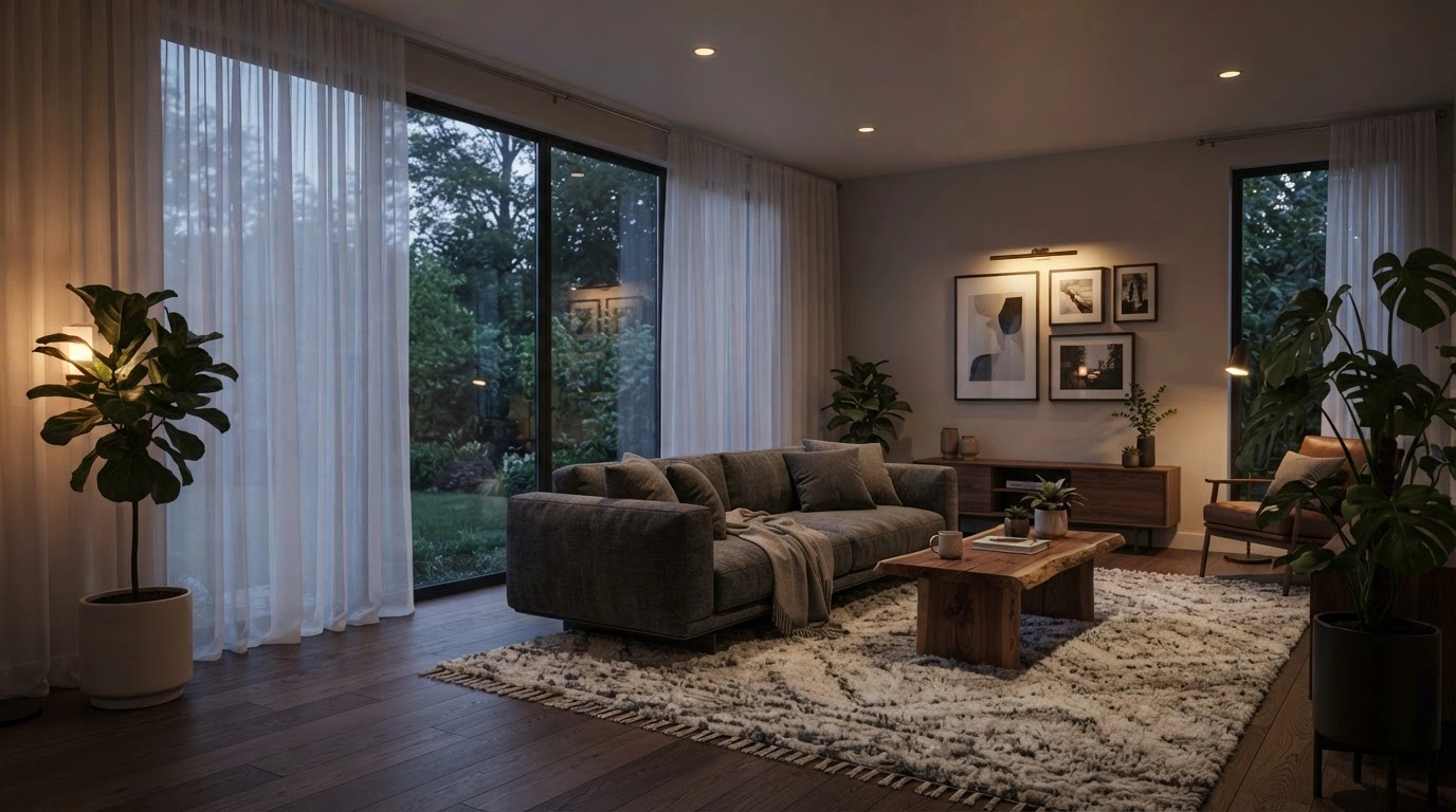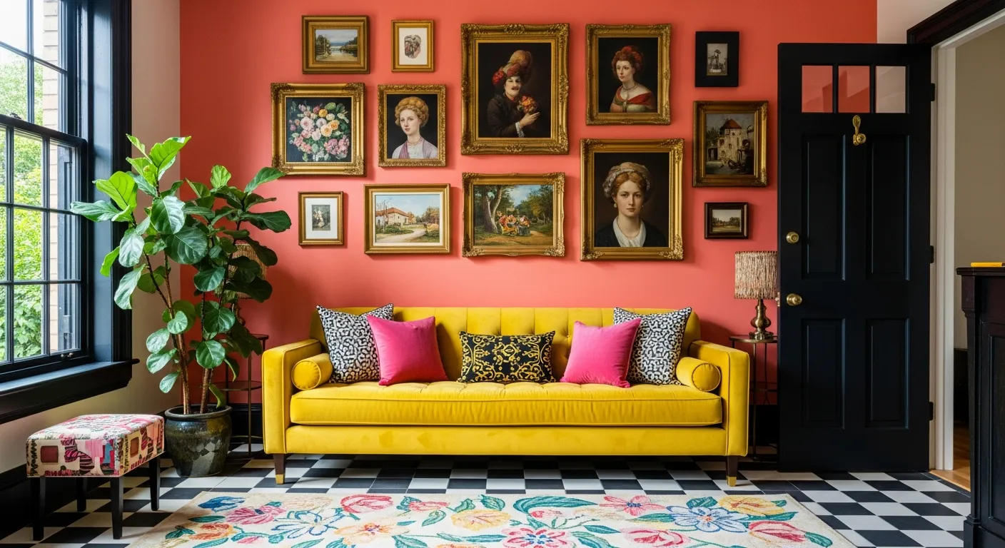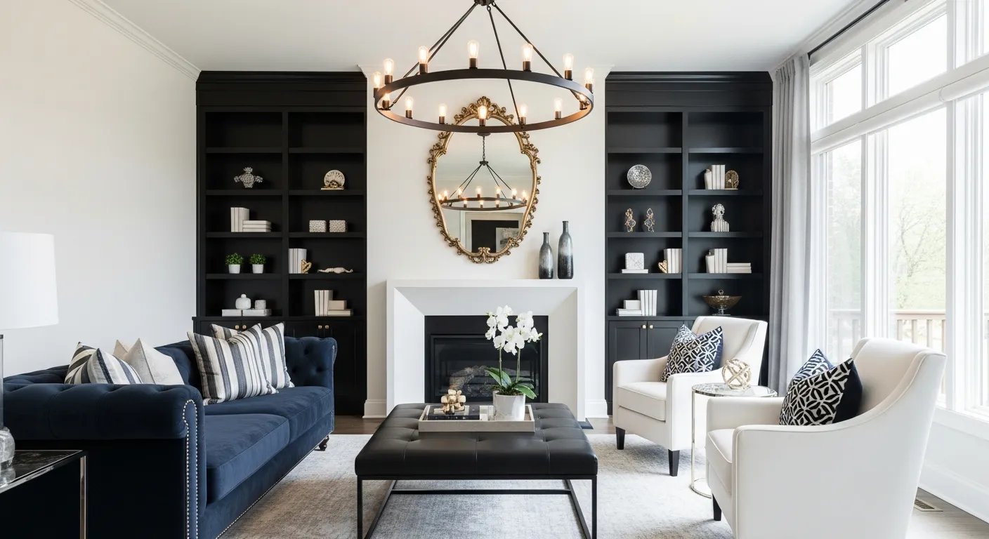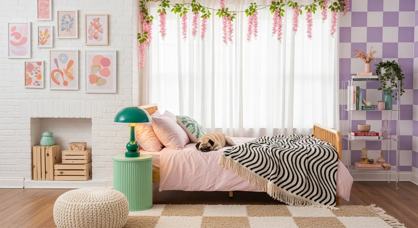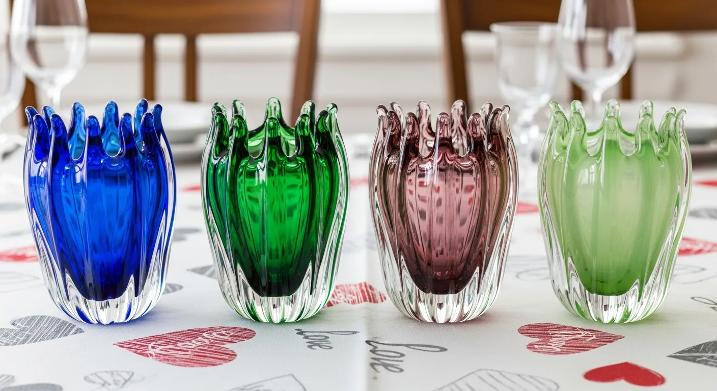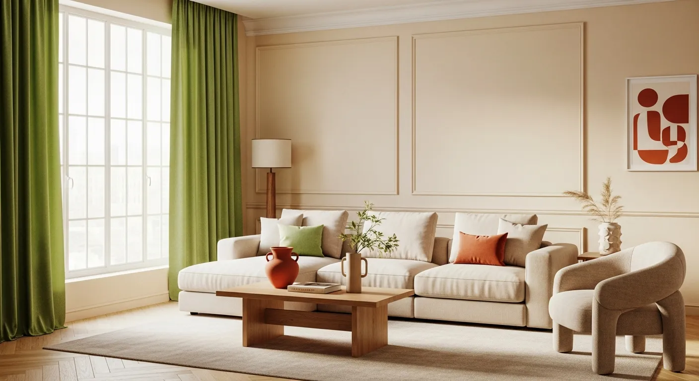
Also known as the golden ratio, the 60-30-10 rule in interior design refers to the balance of three core colors in a space. A main color will occupy 60% of the space, a secondary 30%, and an accent 10%.
The rule is a guiding principle for making a space more cohesive. Interior design can significantly affect how people perceive and react to spaces, so balance is key to creating a coordinated and harmonious effect.
Experts use this rule to help homes feel harmonious and balanced, and it serves as a simple starting point for anyone to create a space that looks professionally decorated. By incorporating this design tip, homeowners can decorate with confidence.
How It Works?
The great thing about this ratio is that it can be applied to any room with any style.
Whether you are looking to choose a whole new style or update your home with a fresh color, this rule can help make your decision-making more streamlined and effective. It’s timeless and mathematical — it can accommodate any colors, trending patterns, textures, lighting or styles, so it works for everyone.
How To Apply 60-30-10 in Designs?
The following applications of the 60-30-10 design ratio showcase how to integrate the design theory with various color combinations and trends.
Neutrals
Light, neutral palettes often feature white as the main color, but you can also use other neutral colors and even textures, such as wood, to balance out the room. Use furniture and even flooring to help create a cohesive design. Natural lighting can also accentuate these spaces, opening them up and allowing accents to pop without the need for bold colors.
When determining your main 60% color, consider the central pieces of the room. Interior Designer Jennifer Ma of Dwell & Oak suggests, “Standard components of the most significant percentage you’ll want to work with are walls, accent pieces, rugs, sofas, and large foundation pieces.” This balance of items helps establish the ratio, even with neutral colors.
For example, when white is the primary color in a bedroom, all, if not most, of the walls and bedding should be white. The secondary neutral design color may be a lighter wood, used in furniture pieces, wall and ceiling accents or as a color on the bedding. Finally, the accent color may be a dark brown or even black, used very sparingly to draw attention to a specific focal point. Think of a throw pillow in the center of a bed or a prized piece of art.
Monochromatic
For rooms that want to remain one color or within the same color family, the 60-30-10 rule can still help balance the space. It can keep the one color from becoming overbearing or distracting.
To successfully implement the golden ratio into monochromatic spaces, designers must first determine the main hue to use throughout. This may be a lighter shade of the color for more subtle monochrome designs, or it may be the darkest shade for a bolder room design. The second color should contrast sufficiently with the first to serve as a distinct design choice. In monochromatic spaces, the accent color may be a metal finish, wood texture or pattern to draw visual interest.
Emily Shron, interior designer of Shron Designs, considers monochromatic palettes chic and minimalist, stating, “Nothing is more luxe than a monochromatic palette.”
For example, green is a versatile color with many different shades that can create a cohesive palette without becoming overly dominant. Consider a neutral olive or jade as the main 60% for walls and rugs. For the secondary 30%, a deep emerald can add a bit of luxury to a centerpiece couch and curtains. Finally, a pop of vibrant mint decor items, or a brassy flair on a mirror or picture frame, can pull the room together.
Bold and Bright
Highly contrasting colors on opposite sides of the color wheel are complementary and may result in stark design choices. Building a color palette with the 60-30-10 rule can be as simple as identifying those two contrasting hues and adding a basic accent, such as white or gold.
Contrasting, bold colors are not for everyone. “Colors are emotional anchors. Whether you’re drawn to them or avoiding them, they’re often rooted in the visual language of your childhood,” says Gala Magriñá of Gala Magriñá Design. This approach to the golden ratio can be fun, bold, and even playful.
Contrasting colors don’t have to be the main focus, either. When using white as the primary color, the design can incorporate one secondary color in 30% of the space and its complement as the remaining 10%. This pop of color will stand out exceptionally.
Consider navy walls paired with orange furnishings and white window trim. Or, flip the ratio with white walls, blue furniture, and a flare of orange.
Make Homes Pop With the 60-30-10 Rule
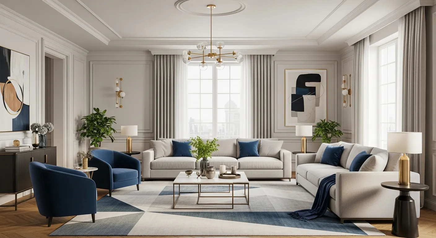
The golden ratio of interior design is a useful method for incorporating cohesive color palettes and structure into homes. Westchester interior designers recommend this ratio, offering insights on how to incorporate colors and achieve a balanced space. By taking inspiration from the 60-30-10 rule, spaces can feel more harmonious and professionally designed.